When it comes to schools, colors can make the difference between a bland, passive setting and an environment where attentiveness and interaction thrive.
Have you ever been so angry that you see red? Or maybe something you didn’t expect came out of the clear blue sky? These are well known idioms and, as it turns out, there is truth to them.
Many studies have explored how people react to color. Some colors stimulate. Think of red: it could mean anger, or it could mean alertness. Other colors calm: blue might suggest sadness, but it might also indicate tranquility . . . like a clear blue sky.
Interior designers draw from color research to fine-tune school color palettes that can give students an educational advantage.
Colors Comfort
Sometimes, students can feel intimidated or even overwhelmed when they enter a school. Fortunately, the right color can welcome students to a place that is both warm and vibrant.
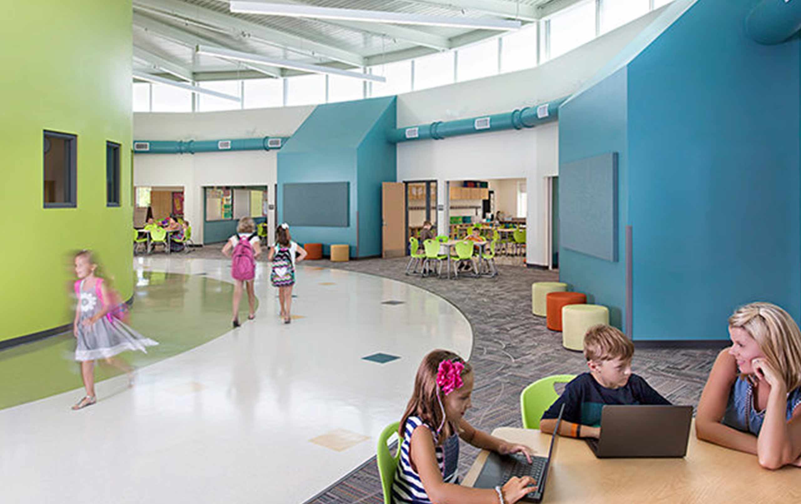
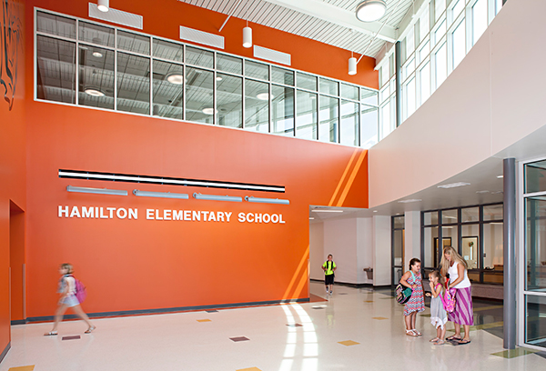
Hamilton Elementary School in Moline, Illinois has a warm brick exterior. However, the two-story entry lobby, with its abundance of daylight, had the potential to be overwhelming to some students . . . especially the younger ones.
Instead, a lively orange wall greets students as they enter the space. It’s a warm color that signifies comfort, happiness, and social interaction. This is a safe place where teachers and students can mingle.
Colors Focus
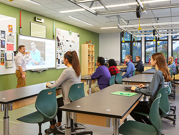
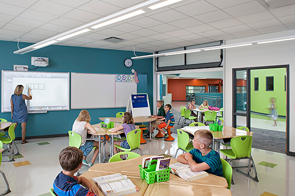
Studies show that cooler colors support concentration and information absorption. A blue or green teaching wall draws students’ attention to the instructor. Similar colored seating suggests a calm setting. Greens and blues can also bring the classroom atmosphere to common areas.
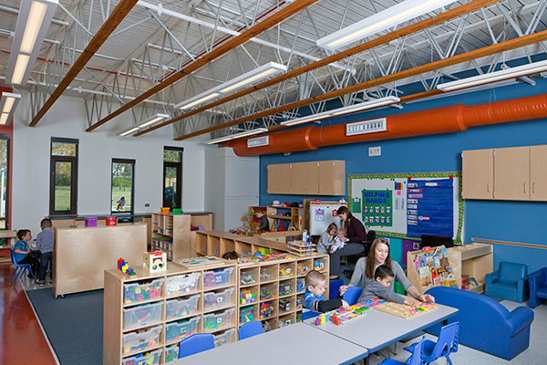
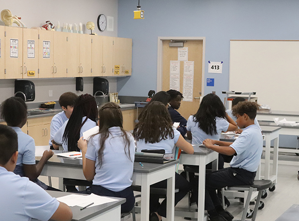
Though these soothing colors apply to all educational levels, the brightness needed can decrease as students grow older. For instance, whereas classrooms at Addison Early Learning Center (Addison, Illinois) have bright blue walls, labs in an addition at Glenbard West High School (Glen Ellyn, Illinois) have a more subdued sage green teaching wall.
Colors Stimulate
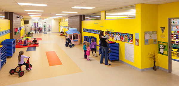
Today’s schools have many spaces where children need to feel comfortable socializing. Colors help—energetic colors inspire activity and interaction, whether it’s within an early learning center multipurpose room or a high school corridor gathering area. Reds, oranges, and yellows on walls and in furniture identify zones that encourage communication.
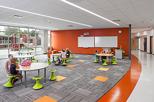
When it comes to libraries and media centers, a bold wall can signal the shift from quiet study to collaboration. In Hamilton Elementary School, the orange of the lobby wall carries through to the media center and the cafeteria space. Green Hokki stools and exterior views help neutralize the orange.
Again, we tend to use brighter colors to appeal to more reserved early learners.
Colors Engage
For decades, students have used colorless corridors solely to get from one class to the next. Color changes that—paint, wall graphics, and art objects extend learning beyond the classroom. Bright furnishings or splashes of color in flooring not only help guide students to corridor gathering areas, but also reinforce the excitement of learning.
Colors Complement
We can also bridge color theory with other sources of inspiration to tell a school’s story. Everything from the building’s exterior and the community’s natural highlights to a school’s history can influence the selection of colors.
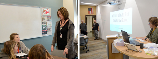
For major renovations at LaSalle-Peru High School (LaSalle, IL), the interior design had to respect the history of the 90-year-old building, Thus, we couldn’t justify bold colors in a building that has a beautiful Gothic exterior, but the design also had to convey a modern learning environment.
The interior design team drew inspiration from popular clothing colors in the early 20th century when the school was built. We found the colors to be more muted, but certainly not devoid of personality. Those colors, used in combination with seasonal (winter, fall, spring) colors, give each of the school’s three floors its own identity. The color palette also helps with wayfinding and identifying departments.
Simplicity and Contrast
I also advise schools to curtail the number of colors in their palettes. When the time for touch-ups comes—and that time will come—it’s easier and more cost-effective if maintenance personnel only have to deal with a few paint cans.
Finally, the ideal school interior will offer a contrast between cool and warm colors. If you use just cool colors, the environment seems washed out and dull. If bold colors dominate, the setting can be overwhelming.
Administrators, teachers, and educational designers all want students to succeed. When they work together to create supportive educational settings, they are well on their way to helping students pass . . . with flying colors.
Contact us to learn more about educational design or comment below to share your thoughts on this post.